Free Printable Calligraphy Practice Paper
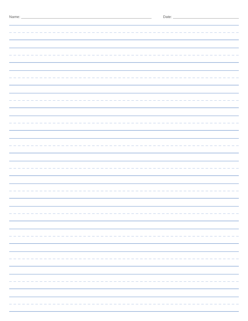
Guide sheets with ascender, waistline, baseline and descender lines, plus slant lines for the script you are learning.
Ready-to-print calligraphy paper PDFs
Want a one-click download? These PDFs use the preset settings, with a 10 mm margin, and print at actual size.
| Preset | US Letter | A4 | Customize |
|---|---|---|---|
| Italic (85°) | Download Italic (85°), US Letter PDF | Download Italic (85°), A4 PDF | Open in generator |
| Copperplate (55°) | Download Copperplate (55°), US Letter PDF | Download Copperplate (55°), A4 PDF | Open in generator |
| Spencerian (52°) | Download Spencerian (52°), US Letter PDF | Download Spencerian (52°), A4 PDF | Open in generator |
| Foundational (vertical) | Download Foundational (vertical), US Letter PDF | Download Foundational (vertical), A4 PDF | Open in generator |
About calligraphy paper
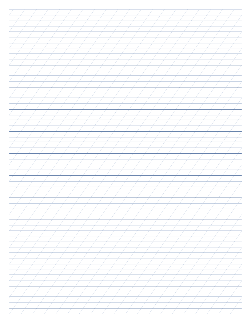
Calligraphy practice paper has four horizontal guides for each row: the ascender line, the waistline marking the top of lowercase letters, the baseline and the descender line. The distance between waistline and baseline is the x-height, which in broad-edge calligraphy is usually measured in nib widths.
Slanted guide lines keep every letter on the same angle. The presets cover Italic at 85 degrees, Copperplate at 55 degrees and Spencerian at 52 degrees, and a vertical 90 degree option suits foundational and uncial hands. All the proportions are adjustable.
Print the guides in a pale colour and write on them directly, or slip the sheet under thin paper on a light pad.
What you can use it for
- Broad-edge nib and brush pen practice
- Italic, copperplate and spencerian lettering
- Modern calligraphy and hand lettering drills
- Learning x-height and ascender proportions
- Planning lettering layouts
The options explained
- x-height. Height of lowercase letters. For broad-edge pens, measure it in nib widths.
- Ascender height. Distance above the waistline reached by tall letters like b, d and l.
- Descender depth. Distance below the baseline reached by letters like g, p and y.
- Extra space between rows. Blank gap between one row and the next.
- Slant angle. Angle of the slanted guides, measured from the baseline.
- Slant line spacing. Horizontal distance between neighbouring slant lines.
Printing tips
- Print the guides in a pale colour so they do not compete with your ink.
- Start with an x-height of about five nib widths for italic, then experiment.
- Use thin paper over the guide sheet if you want a clean practice page.
For more detail, read the guide to printing paper at home.
Frequently asked questions
What slant angle should I use?
Copperplate is traditionally written at about 55 degrees and Spencerian at about 52. Italic is only slightly slanted, at around 85 degrees, and foundational hands are upright at 90.
How tall should the letters be?
For a broad-edge pen, italic x-height is commonly five nib widths. For pointed pen scripts, x-height is often a few millimetres with much taller ascenders and descenders.
Can I use this for brush lettering?
Yes. Increase the x-height and spacing, and use the slant guides to keep strokes consistent.
Is it suitable for left-handed calligraphers?
Yes. The slant guides can be turned off or changed to suit you.